

The Problem with McMansion Architecture

This house is back up for sale, and it reminded me that I built a house across the street from this one 10–15 years ago. I hated it then, but more because of its “wow, look at me” nature. Now, after maturing and learning more, I want to circle back and confirm that my hate was well-placed. Haha.
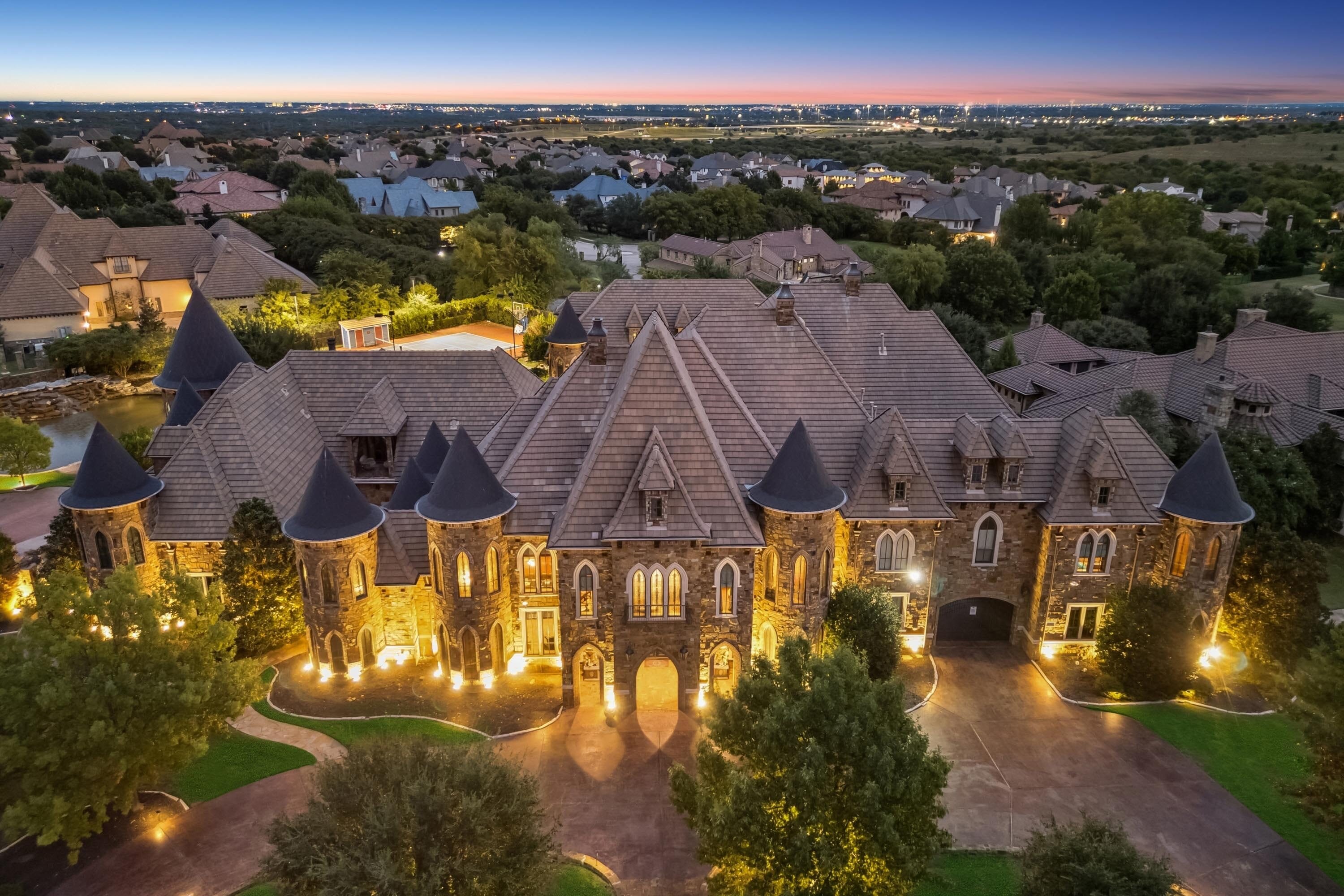
The style of this house, I think, is grounded in Renaissance architecture of the Loire Valley in France. This rich and wealthy area in the 15th and 16th centuries developed an architectural style that was unique and beautiful. It might make you cringe a little bit, as this too is where the Disneyland image gets some of its inspiration. It is a real architectural tradition.


The builder of this house did a few of them in the Metroplex, and I don’t know if I should appreciate his moxie or rail against his work.
The difference between the Renaissance architecture and this house is the semi-Gothic and soft castle theming he employs. The exterior windows are Gothic around the house, and the turrets seem to pop out like acne on a teenage boy.
This theming falls apart for me on the inside, and I think I’m most justified in my wrath as I see how he has organized and put together this home. The discombobulated nature of this open floor plan is highlighted in this picture. The long fireplace wall attempts to anchor the room. The fireplace is made up of large parts that then—because they don’t know what to do—apply open areas with applied faux carving. The fireplace might anchor the room if the staircase wasn’t competing for attention.
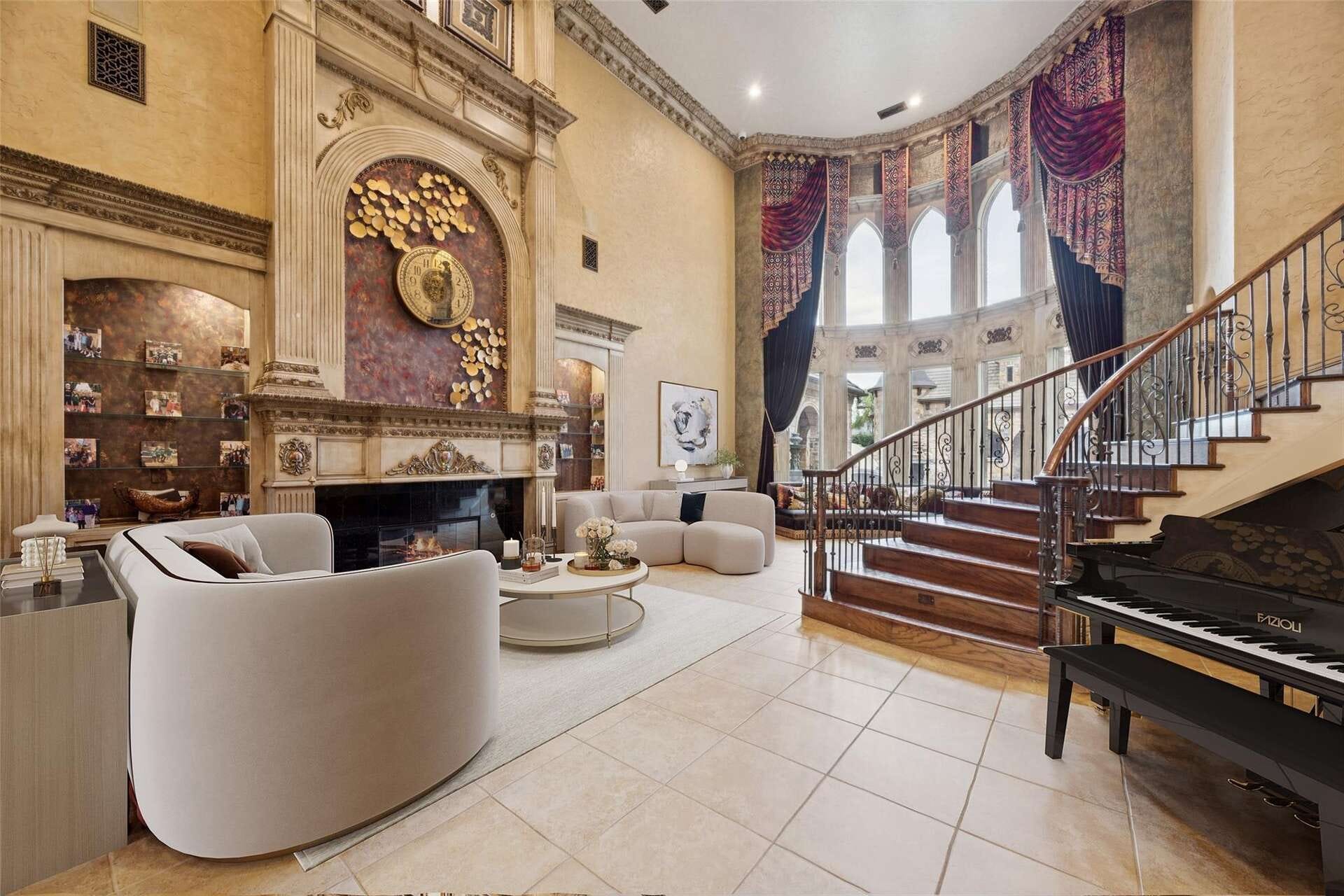
What I notice in this house is that there are no “fine or rich” materials that give weight to the story. The stairs attempt to be grand by their size, but the treads and handrails are the same handrails and treads that might appear in a starter house selling for a tenth of the cost.
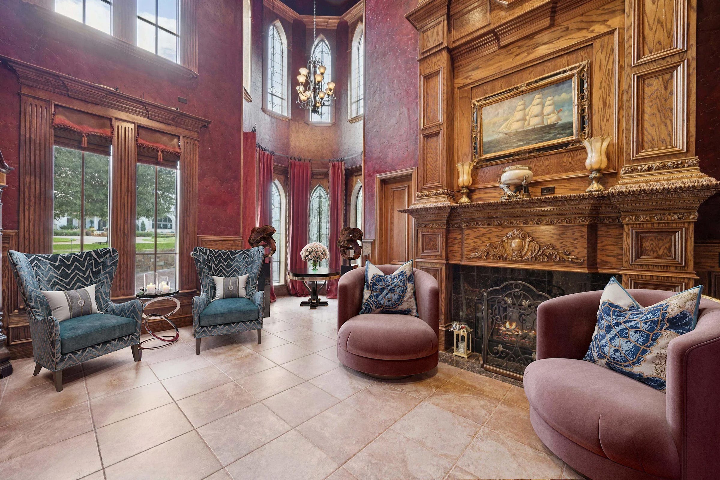
When we review this grand fireplace here, we see similar themes but notice the oak plywood. It is rotary-sawn or plain-sawn, which yields wild patterns and an odd composition. They throw applied carvings at this to make up for the mess.
Note too that the turret is not rounded off on the inside but made square, seemingly to avoid having curved moldings.
The indoor pool has the last frustrating element.
I’m critical of this because the builder has tricked the homeowner with fancy (turrets, grand rooms, and Gothic shapes) but filled it with no fine craftsmanship, no fine materials, no rich or timeless elements, and no rich building traditions that are enduring. Instead, it’s cheap tricks to fool the eye.


This is part of why architecture is ugly today. Beauty has been replaced by grand shows and parlor tricks. The homeowner spends millions of dollars on what I think is a mess. I don’t know whether to blame the homeowner for being tricked by a snake oil salesman or the builder for selling this oil.
It’s no wonder people don’t like columns, carvings, and details that used to define good taste. It is because knuckleheads like this use them as a parlor trick, and most people recognize the game or choose to avoid it altogether.
My hope for building and master builders is that they could help expose fakery and instead begin to build so that fine craft and timeless beauty can be the norm.
Good luck finding the leak when some flashing fails
Great post. I laughed out loud a few times at your commentary - funny, factual, and informative!